On this page
Software isn’t rejected because it lacks features; it is abandoned because using it feels like a second full-time job.
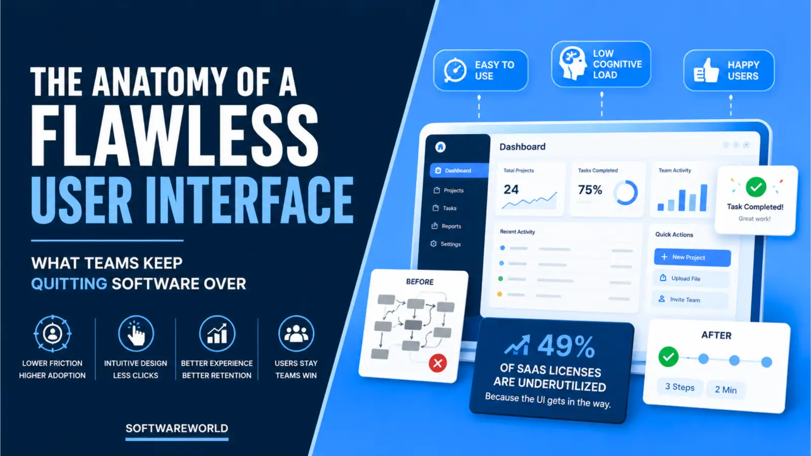
CFO Dive recently found that enterprise teams use just 49% of their paid SaaS licenses, letting $18 million sit idle every year, proof that software user adoption friction points cost more than missing features ever could.
If your adoption numbers are stalling, you have likely lived this. Users don’t quit because your tool couldn’t do the job; they quit because it takes too much of their effort to get things done. Adding more features to this mix, the usual flex, only adds to their learning curve.
A flawless interface does the opposite. It cuts time-to-complete-task, lowers cognitive load in software design, and turns renewals into a formality instead of a fight.
This guide maps exactly where friction hides within the product, how you can measure it, and what it takes to build interfaces that users won’t want to quit.
› Quick Summary (TL;DR)
Enterprise software gets abandoned when the interface, not the feature set, makes basic tasks harder for your user than they should be. Fixing these software user adoption friction points like buried navigation and unlabeled icons isn’t a design nicety. It is one of the most direct ways to protect your renewal revenue and net revenue retention.
› The Economics of Bad UX
Your software rarely gets rejected in the demo stage. It is abandoned during production, one workaround at a time.
Forrester Consulting found that organisations investing in usability research and testing saw 415% ROI over three years, with payback under six months. That proves fixing friction isn’t just a line item on your design budget; it is a financial one.
The real cost of cognitive load in software design shows up long after you have signed the contract. It shows up in support queues, your stretched timelines, and even the churn nobody flags until renewal.
Every buried menu and unlabeled icon forces your users to think before they can act. That thinking has a price tag. A support ticket costs your team an agent’s time and effort. Consequently, a confusing workflow costs your implementation manager weeks of schedule. These friction points nobody measured will cost your accounts team during renewal.
Width: 0px, Height: 0px
Width: 1403px, Height: 935px
Width: 1403px, Height: 935px
Width: 1403px, Height: 935px
Width: 1403px, Height: 935px
Width: 1403px, Height: 935px
Width: 1403px, Height: 935px
Width: 1403px, Height: 935px
Most of your procurement checklists fail this stage. That’s because you still ask the vendor if the feature exists, not what it costs your user to actually find it on the platform.
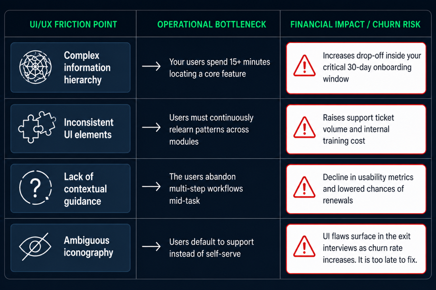
Here’s a detailed table that maps the pattern, including the friction point, the bottleneck it creates in your day-to-day operations, and the financial exposure it creates by the time it reaches the next renewal conversation.
» Hidden Cost of Poor UI/UX
| UI/UX Friction Point | Operational Bottleneck | Financial Impact/Churn Risk |
| Complex information hierarchy | Your users spend 15+ minutes locating a core feature | Increases drop-off inside your critical 30-day onboarding window |
| Inconsistent UI elements | Users must continuously relearn patterns across modules | Raises support ticket volume and internal training cost |
| Lack of contextual guidance | Users abandon multi-step workflows mid-task | Decline in usability metrics and lowered chances of renewals |
| Ambiguous iconography | Users default to support instead of self-serve | UI flaws surface in the exit interviews as churn rate increases. It is too late to fix. |
None of these traps shows in your features list. They occur during support queues, churn reports, and renewal calls that get worse than you had expected. That’s exactly why they belong to your financial scorecard, not just design reports.
› The Core Friction Points Costing You Users
Every friction point traces back to one of the three root causes. By naming them, you can find them in your own product before the churn report does it for you.
The three friction points behind almost every case of software user adoption friction are interaction cost, hidden navigation, and the gap between demo and the user’s actual first day in the product.
Left alone, each of these compounds into what shows up on your renewal call as software churn UI flaws, the friction nobody flagged until the contract was at risk.
» The Click Tax
The click tax is the cumulative time and effort your user loses every time a workflow demands more clicks than the task itself requires.
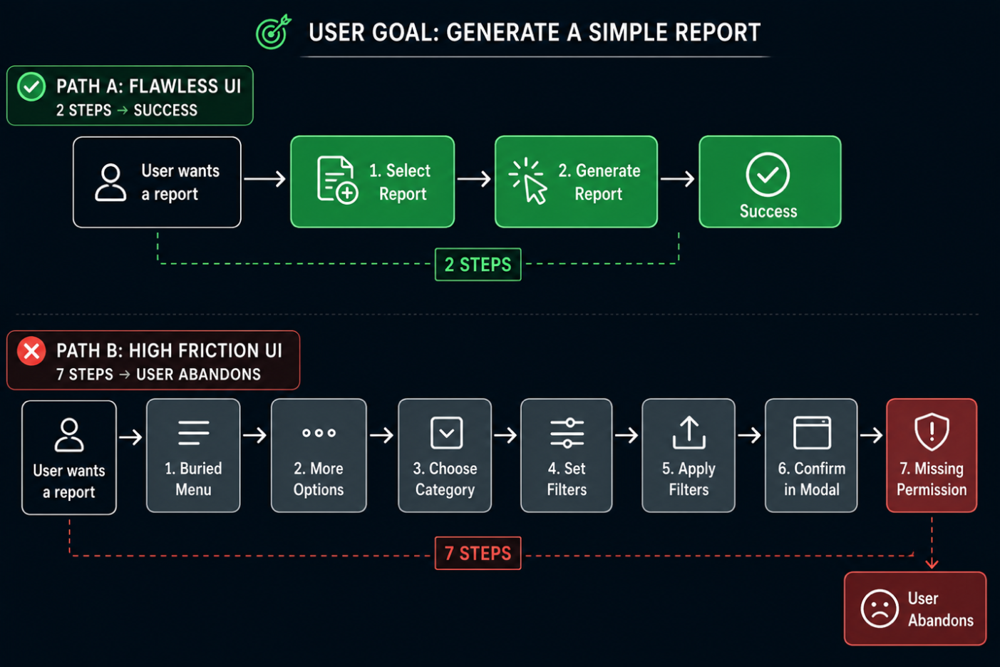
Each extra click your user has to make is a small tax on their patience, and these taxes compound. For example, a workflow that takes about 2 clicks in a demo environment may take about five to six clicks in a production environment once real data, permissions, and edge cases enter the picture.
Your users don’t consciously count clicks; they simply notice that getting things done inside the product takes longer than it should. That’s where disengagement starts.
You don’t need to redesign everything. Simply restyle one of the smaller UX design patterns to reduce churn. It could be collapsing a workflow back to the minimum number of steps or cutting down the extra clicks real data and permissions have quietly added since the demo.
Width: 0px, Height: 0px
Width: 1403px, Height: 935px
Width: 1403px, Height: 935px
Width: 1403px, Height: 935px
Width: 1403px, Height: 935px
Width: 1403px, Height: 935px
Width: 1403px, Height: 935px
Width: 1403px, Height: 935px
» Hidden Navigation and Cognitive Load
Hidden navigation is any interface pattern, such as an unlabeled icon, buried menu or collapsed panel, forcing your user to guess instead of act.
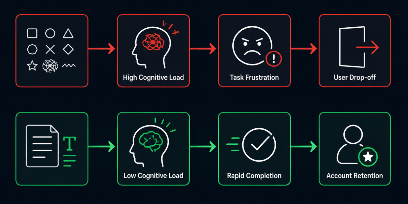
An unlabeled icon isn’t the tool being minimalist; it ends in a guessing game that your user is asked to play every single time they open the app. That’s where cognitive load in software design does most of the damage.
Your users are left to use their working memory decoding your interface instead of using it. A clean layout that sacrifices clarity for looks doesn’t feel simple to the users. It feels unfamiliar, which is when enterprise teams stop logging in.
This is a compounding cost, not a one-time expense. Every unlabeled icon your user has to decode today is a decision they make again tomorrow. That’s because nothing about the interface taught them the answer first time around.
» The Onboarding Cliff
The onboarding cliff is the gap between the guided, error-free environment your sales demo shows and the empty, unguided product your user actually opens on day one.
Your sales demo runs on curated data, a guided script, and zero friction by design. But your user’s day one runs on an empty dashboard, no guidance, and a task they are expected to figure out alone.
That gap between promise and empty state is where you lose your most motivated new users, the ones who had logged in ready to succeed.
The wider that cliff, the faster you lose them. A new user who hits a blank dashboard with no next step doesn’t conclude the product is broken. They conclude it isn’t worth their effort, and that conclusion forms within minutes of a relationship you spent months trying to close.
None of these friction points show up in the features list, sales call, or the signed contract. They show up in your product in the first week your real user is left alone with it.
Width: 0px, Height: 0px
Width: 1403px, Height: 701px
Width: 1403px, Height: 701px
Width: 1403px, Height: 701px
Width: 1403px, Height: 701px
Width: 1403px, Height: 701px
Width: 1403px, Height: 701px
› The Anatomy of a Flawless User Interface
Every friction point we discussed till now has a fix. Here’s a blueprint for building the interface that solves every point.
A flawless interface is built on three solid pillars:
- Predictability in how it looks & behaves
- Responsiveness that confirms every action you take
- Design that treats an empty screen as a starting point, not a dead end
If you get these three right, you have built an antidote to the UX design patterns that reduce churn. You don’t need to add features to reduce churn. Remove the friction between your users and the outcome they come for, and you have improved retention rate.
» Predictability Over Novelty
Your users shouldn’t have to relearn your product each time they open a new module. Prioritise consistent placement for predictability. The search bar should always be on the top-left. The primary action must be the same colour, and an icon representing a particular thing should stay the same throughout the product.
Predictability doesn’t mean simplistic. It just means your users must stop spending working memory on “where is this” and start spending their efforts on completing the actual job.
» Responsiveness and Feedback Loops
Every action your user takes must get them an answer. A save action that doesn’t get a visible confirmation, a form that fails silently, or even a button that doesn’t offer an indication it registered a click forces the user to guess if the action went through.
Micro-interactions close that loop immediately. A checkmark, a subtle colour shift, or even a single-line confirmation can help. These are small signals, but they are the difference between a user who trusts the product and one who double-clicks everything out of anxiety.
» Designing for Empty State
A blank dashboard on day one isn’t neutral. It is the decision point, and most products get it wrong by leaving it blank.
Turn it into a guided first action instead. Suggest their next step, offer a sample dataset, or give them a clear CTA that helps them understand what “using the product well” looks like.
This is your single high-value design pattern in the onboarding flow, as it is the first thing a new user sees immediately after the sales demo.
| Usability Pillar | What it Means for your Enterprise Use | Key Metric to Track |
| Predictability Over Novelty | Consistent layout placement and standardised visual patterns across all product modules | Task Completion Rate (TCR) |
| Responsiveness & Feedback | Instant visual confirmations and micro-interactions to validate every click. | Support Ticket Deflection Rate |
| Designing for Empty States | Interactive setup wizards and sample data eliminate the day-one blank state. | Time-to-Task Completion (TTC) |
When you build your product UI against these pillars, you aren’t just reducing support tickets; you are building the enterprise UX ROI case.
› Data-Driven Proof: The Enterprise UX ROI
Here’s the number your CFO actually wants to know: what does fixing the UI/UX issues get you back?
Research cited by Stripe shows a 5% improvement in customer retention can improve profitability by 25-95%. It also indicates that retaining an existing customer costs 5-25x less than acquiring a new one.
Enterprise UX ROI isn’t a soft metric. It is the retention level with a multiplier attached to it.
Every friction point you remove from your user interface shows up on the same line item your board already tracks: net revenue retention. A customer who completes their task without a support ticket renews without a fight. Subsequently, a customer who fights your interface for a year starts quietly shopping for competitors before the renewal call gets scheduled.
That’s the argument that gets your UX overhaul funded when login and satisfaction scores fail to. Executives don’t act on a statement like “users find this confusing.” They act on “this is costing us renewal dollars” because that’s the language their own scorecard uses.
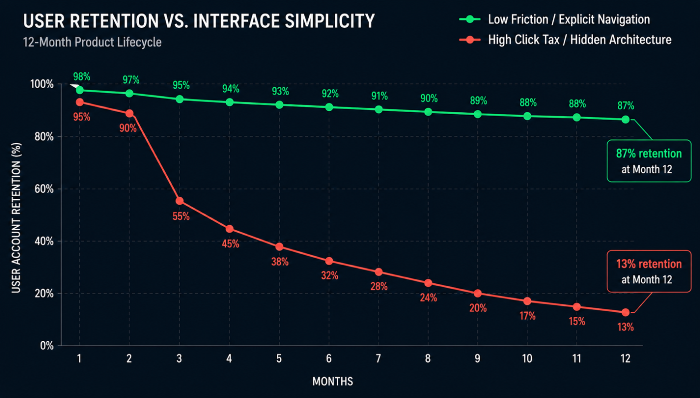
› User Retention vs. Interface Simplicity over a 12-Month Product Lifecycle
Width: 0px, Height: 0px
Width: 1403px, Height: 799px
Width: 1403px, Height: 799px
Width: 1403px, Height: 799px
Width: 1403px, Height: 799px
Width: 1403px, Height: 799px
Track this over 12 months, and the pattern holds. The accounts with the fewest support escalations and the fastest time-to-task almost always renew at expansion, not at risk.
That is not a coincidence your team should keep discovering account by account. It is a predictable outcome once you treat interface friction as a retention metric instead of a design option.
That becomes a full financial case, from the first wasted license to the renewal it actually costs you. Whatever is left is something your team can actually act upon.
› Conclusion
Your users were never asking for additional features. They were simply asking for less friction between logging in and getting a task done. Every trap identified in this guide, from click tax to a buried icon, is a variation of a failure where product makes the user work harder than the job requires.
Software user adoption friction points shouldn’t be treated as a UX footnote. They are the high-value catalysts protecting your renewal revenue. Fixing them costs much less than losing a user account on your product.
The team that gets this right doesn’t ship more features. They offer UX design patterns, such as honest feedback loops, empty states guiding the user, and predictable navigation.
If you are evaluating software for your own stack, this is exactly the lens to apply before you sign a contract. Don’t check if it has a particular feature. Determine if your team will actually use it one year from now, and you have the answer.
› FAQ
1. What causes low software user adoption?
Ans. The reason is the software user adoption friction points inside the interface, like buried navigation, unlabeled icons, and an empty dashboard on day one. All these make using the product harder than the task it is meant to simplify.
2. How do you measure UI friction inside your product?
Ans. By tracking task completion rate, time-to-task completion, and support ticket volume by feature area, you can measure UI friction inside your product. If a simple action takes your users more than two clicks and several seconds to locate, it is a friction you must audit.
3. What is a good onboarding benchmark for enterprise software?
Ans. A good onboarding benchmark is a new user completing their first meaningful task within minutes of login and not their first session. Anything beyond that particular window starts building retention risk for your business.
4. How is UX ROI different from a UX budget line?
Ans. UX budget is a cost, while UX ROI is retention and expansion revenue that the budget protects. It is measured against UX ROI benchmarks like reduced support load and higher net revenue retention.